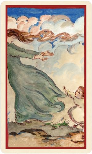

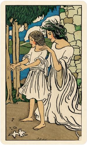


Smith-Waite® Tarot Borderless Edition [Colman Smith, Pamela] on desertcart.com. *FREE* shipping on qualifying offers. Smith-Waite® Tarot Borderless Edition Review: FIVE STARS and why when the US GAMES SMITH WAITE CENTENNIAL is my FAV deck - My GO TO deck is the US Games Smith Waite Centennial. I had hesitated getting this deck for some time, but after looking at some vids online, decided I really wanted it. HERE'S why I gave FIVE STARS: CARDSTOCK - ok, yep, this is a biggie. I really like cardstock a lot. Nice heft. My preference would have been more of a linen texture, but NOT worth taking off even half a point. BORDERLESS - Love how the borderless makes it pop. Yep, the Smith Waite Centennial still my fav, but this is a close second. I also love how the borders are rounded so nicely. COLORS - I compared with Radiant Borderless and JUST prefer this one because it feels more authentic. I like the vintage coloring and it has stayed pretty darn true to the Centennial. Yes, some images are expanded more, but the colors, the faces, look pretty spot on. The Radiant, and I GET why some prefer it, the colors do pop more, just feel like a knock off of the original, which it is. The really deal breaker why I won't get that one is aside from the colors, they have changed some of the images, the faces. That makes it NOT a Pixie deck to me. But that's a PREFERENCE thing. My suggestion is watch a YouTube vid COMPARING the two, side by side, card by card. BACKS - Yes, I prefer the color of the backs of the Centennial, but GLAD they're not exactly alike. I like they changed the color of the backs. Makes it more it's own deck. EXTRA PIXIE CARDS WITH DRAWINGS! GREAT BONUS PRICE - Got this for about 20 bucks and for the quality, VERY HAPPY. Actually, would have gladly paid more. BOTTOMLINE: If you liked the Centennial, you may wish to check this one out. YouTube vids will tell you if it's one you need in your collection. Review: Beautiful artwork - The stock is sturdy and the cards are not glossy, they have what I call a mat finish. The colors are muted and pleasing to the eye. There were 4 extra cards showing the artist's other styles of artwork. To me I see the elements in these 4 and I think that I will use them as a representation of the person I am reading for. The cards and box came in good condition, the box is very sturdy. There is a little book with them of course. The book is a different story, it is well made and the paper is of a good quality. The text is a good size and easy to read. Those things are good and somewhat important, but the bad is a problem. The meanings are just too black and white, they seem matter of fact. In my opinion they are as if they looked the word up in the dictionary. As an example, the Death card " End, mortality, destruction, corruption." and that is the positive! I always look for the meaning of the Death card because it is the most misleading of the Major Arcana to me. It is transformation, resurrection, the end of self. It is not just about the end of the physical body. It is the end of a pattern of behavior or thought process that needs to end in order to begin again. Anyway, this is why I do not use the little books. This is a nice deck to add to a collection just because of Pamela Colman Smith.


| Best Sellers Rank | #68,260 in Books ( See Top 100 in Books ) #59 in Fortune Telling #171 in Tarot |
| Customer Reviews | 4.8 4.8 out of 5 stars (2,118) |
| Dimensions | 3.25 x 2 x 5 inches |
| Edition | Cards |
| ISBN-10 | 1572818832 |
| ISBN-13 | 978-1572818835 |
| Item Weight | 2.31 pounds |
| Language | English |
| Print length | 84 pages |
| Publication date | August 11, 2017 |
| Publisher | U.S. Games Systems, Inc. |
P**E
FIVE STARS and why when the US GAMES SMITH WAITE CENTENNIAL is my FAV deck
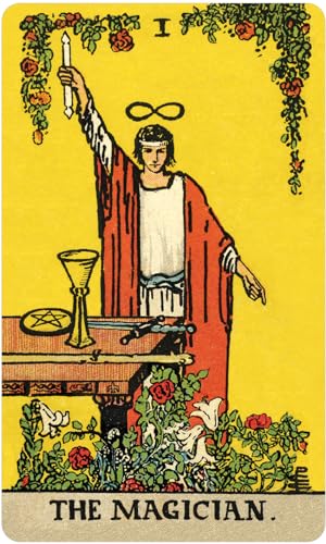
My GO TO deck is the US Games Smith Waite Centennial. I had hesitated getting this deck for some time, but after looking at some vids online, decided I really wanted it. HERE'S why I gave FIVE STARS: CARDSTOCK - ok, yep, this is a biggie. I really like cardstock a lot. Nice heft. My preference would have been more of a linen texture, but NOT worth taking off even half a point. BORDERLESS - Love how the borderless makes it pop. Yep, the Smith Waite Centennial still my fav, but this is a close second. I also love how the borders are rounded so nicely. COLORS - I compared with Radiant Borderless and JUST prefer this one because it feels more authentic. I like the vintage coloring and it has stayed pretty darn true to the Centennial. Yes, some images are expanded more, but the colors, the faces, look pretty spot on. The Radiant, and I GET why some prefer it, the colors do pop more, just feel like a knock off of the original, which it is. The really deal breaker why I won't get that one is aside from the colors, they have changed some of the images, the faces. That makes it NOT a Pixie deck to me. But that's a PREFERENCE thing. My suggestion is watch a YouTube vid COMPARING the two, side by side, card by card. BACKS - Yes, I prefer the color of the backs of the Centennial, but GLAD they're not exactly alike. I like they changed the color of the backs. Makes it more it's own deck. EXTRA PIXIE CARDS WITH DRAWINGS! GREAT BONUS PRICE - Got this for about 20 bucks and for the quality, VERY HAPPY. Actually, would have gladly paid more. BOTTOMLINE: If you liked the Centennial, you may wish to check this one out. YouTube vids will tell you if it's one you need in your collection.
J**S
Beautiful artwork
The stock is sturdy and the cards are not glossy, they have what I call a mat finish. The colors are muted and pleasing to the eye. There were 4 extra cards showing the artist's other styles of artwork. To me I see the elements in these 4 and I think that I will use them as a representation of the person I am reading for. The cards and box came in good condition, the box is very sturdy. There is a little book with them of course. The book is a different story, it is well made and the paper is of a good quality. The text is a good size and easy to read. Those things are good and somewhat important, but the bad is a problem. The meanings are just too black and white, they seem matter of fact. In my opinion they are as if they looked the word up in the dictionary. As an example, the Death card " End, mortality, destruction, corruption." and that is the positive! I always look for the meaning of the Death card because it is the most misleading of the Major Arcana to me. It is transformation, resurrection, the end of self. It is not just about the end of the physical body. It is the end of a pattern of behavior or thought process that needs to end in order to begin again. Anyway, this is why I do not use the little books. This is a nice deck to add to a collection just because of Pamela Colman Smith.
E**A
My Only 5 Star Deck
I have no idea what's taken me so long to pick up this deck. I own around 20 decks and this is simply the best one for me. Here's what I love about it (some of these things may be negatives for you, it's all personal preference): 1) The cardstock is sturdy US Games stock, but thinner than other decks I've purchased from US Games. (I'm thinking right now of the Spiral Tarot which has such thick cardstock that it sometimes gives me cuts from shuffling.) I don't imagine there will be chipping anytime soon. This is such a big difference from some other companies whose decks feel like they fall apart if you use them a lot, and start chipping basically the first day. 2) The price. I'm not one to spend $50 on a deck, but I am used to spending $20-$30. Under $15 is SUCH a good price for a quality deck, even knock offs go for more sometimes. 3) There are a million YouTube videos comparing the coloring of this edition to other RWS editions. This is my fave. Not too vintage or muted (although it is vintage and muted), and not too garish or bright. The blacks and the blues are particularly evocative and beautiful. 4) I get a lot of fliers with this deck, some decks just don't do that for me. 5) I appreciate that it comes with a few tarot-sized prints of Pixie's non-tarot work. I didn't expect to care, but I enjoy having them. 6) The US Games copyright stamp isn't on the image side. It's on the card back, but not the side with the actual tarot images. I really hate when companies put their copyright on the image side, and sometimes US Games does this. I find it so distracting. 7) The images themselves are nice and large but even without borders they still feel "complete." Some decks with borders really hem in the image, and with some borderless decks it feels like the images are just floating when you lay them in a spread. There's nothing about this deck I don't like. For the money it's an excellent choice.
C**E
Absolutely gorgeous
This deck is gorgeous and beautifully made. The borderless is exactly what I wanted. FYI, US Games removed their copyright logo off of the back of the cards so they feel authentic and clean.
J**A
Un pequeño resumen de pros y contras: -La calidad del cartoncillo, muy buena, no es un material plastico, es más bien un cartoncillo, como baraja antigua, se ve resistente y durable :) -la impresión, es muuuy buena, da placer ver las ilustraciones, que sea borderless lo hace lucir bellísimo, es en verdad muy hermoso, de los mas lindos que tengo. -Al tacto es suave, se siente como barnizado pero no plastico, es una carta gruesa y grande, un placer barajarlo :) - El reverso de la carta es un verde esmeralda como avegentado, con una rosa blanca y la firma de la ilustradora, son reversibles. Contras: - La caja no es ideal, fue difícil abrirla sin romperla, recomendando no usarla si no la quieres maltratar, yo inmediatamente cambié el deck a una bolsa de terciopelo y dejé la cajita con el panfleto y las cartas extras (pinturas de la ilustradora, muy bonitas también, dan ganas de enmarcarlas) En resumen: Todo lo que se ahorraron en package, se lo dejaron en la calidad del deck, hermoso, sin igual, en verdad es bellísimo, y es muy honorable que le den su merecido crédito a la autora de las ilustraciones :) el tarot tiene una energía muy bella y suave.
T**S
My favourite of the RWS tarot cards. I’m a big “no border” person when it comes to tarot and despite owning lots of decks the RWS is always my favourite for its easy to read artwork, lots of symbolism and read colours. Great card stock. Nice back card art. (FYI the come looking pristine - mines are just very worn from lots of use.)
A**S
I have been waiting to get these for the longest time. Among all the decks available on the market, this is truly the best! I love the borderless feature and the card quality, color and print is truly so beautiful. Very well and carefully packed. Absolutely worth it! Highly recommended!
M**I
I've had some trepidation using the Rider-Waite-Coleman tarot version because I don't like how images imposed by an artist determine the meanings of the card (preferring the more traditional and harder to read Marseille Tarot). But I will admit I got enamoured by the borderless art and the size of the cards that I decided to get the deck. The images ... resonated with me in a manner I haven't seen in previous decks (TdM included). I haven't done full readings with it yet, but I've been doing daily card draws. The day when I drew the Death card was strangely significant - I thought obvious changes in my life are in play, but didn't expect an actual mortal death was foretold. The deck is really amazing, the borderless images are engaging, and the colours easy on the eyes, also emphasized by the nice matte surface. They're rather big to shuffle properly (and I thought I have big hands) but one only need to look up YouTube videos for alternatives.
M**A
Ich habe dieses Tarot Kartendeck gekauft, um Tarot lesen und deuten zu lernen. Diese Version des klassischen Raider Waite Tarots finde ich fantastisch. Ich liebe es, wie die Bilder sich über die ganze Karte erstrecken, ohne lästige Ränder. Ästhetisch auf jeden Fall gelungen. Das Material der Karten ist sehr gut und dementsprechend auch leicht zu mischen. Die Tarotkarten kamen einfach in einer Kartonbox ohne viel Schnickschnack, sodass sich das Kartendeck gut verstauen lässt und evtl. auch gut mitgenommen werden kann. Das einzige, worauf ich verzichtet hätte wären die paar extra Karten mit Bildern gewesen, braucht man ja nicht zum Tarotlesen, aber es ist auch nicht direkt negativ. Fazit: Bin vollkommen zufrieden mit dem Einkauf.
TrustPilot
1天前
2 个月前